In 2019, our team, UX Research & Design, was approached by the corporate banking division team to develop a visionary concept based on research to attract more users and establish new corporate accounts.
The corporate banking page on credit-suisse.com lacked user-friendliness, and our team was tasked with identifying pain points through analysis to improve conversion rates.
As a UI Designer, my responsibilities included creating visual designs based on wireframes defined by the UX team. I applied the corporate design language to ensure consistency throughout the interface. Additionally, I developed prototypes and created a video for presentation purposes.
To provide a brief overview, Jonny Wray and Michele Miesel, diligently gathered the needs of the stakeholders and conducted thorough research to identify strategies that could attract more corporate users. They translated their findings into initial design drafts, which were then tested with a group of individuals who provided valuable insights. Based on these insights, they refined and updated their drafts to ensure the design aligned with user expectations.
Once the updated drafts were ready, I commenced working on the visuals, taking into account the existing visual guidelines of Credit Suisse. We aimed to maintain consistency with the overall visual language while making minor adjustments to the typography. Additionally, we developed several components that could potentially be implemented on a global scale, incorporating them into our component library.
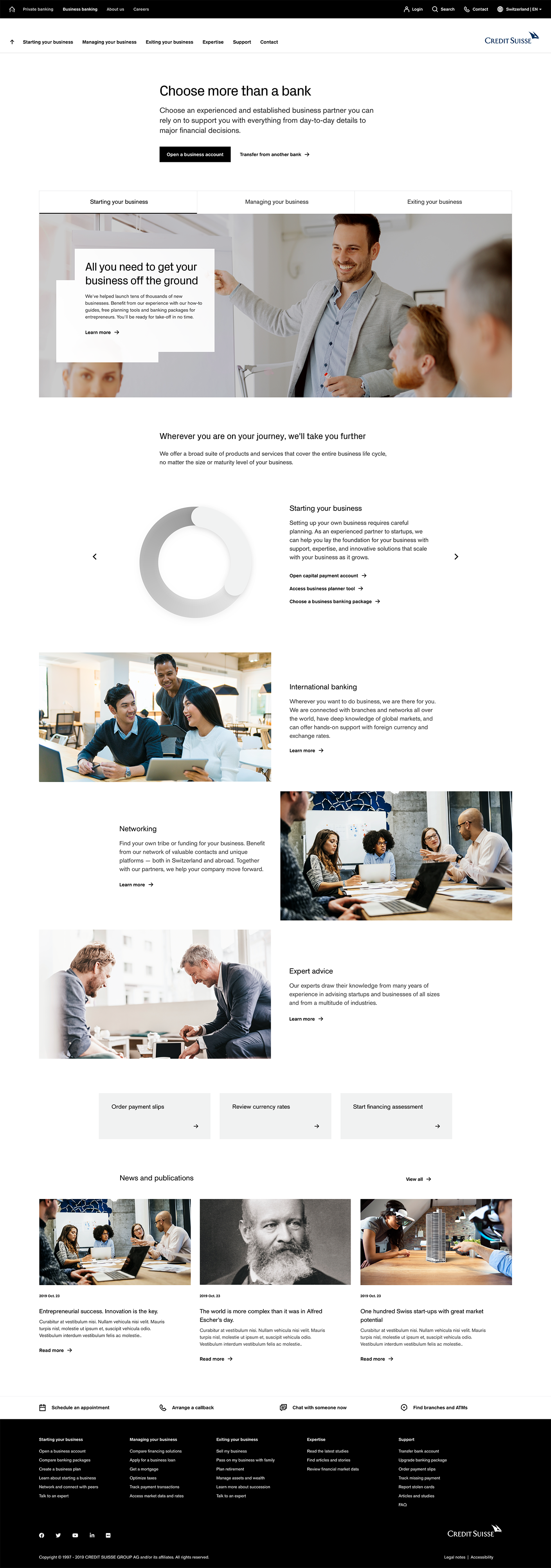
We created a completely revamped navigation system, enabling users to effortlessly locate their desired goals.
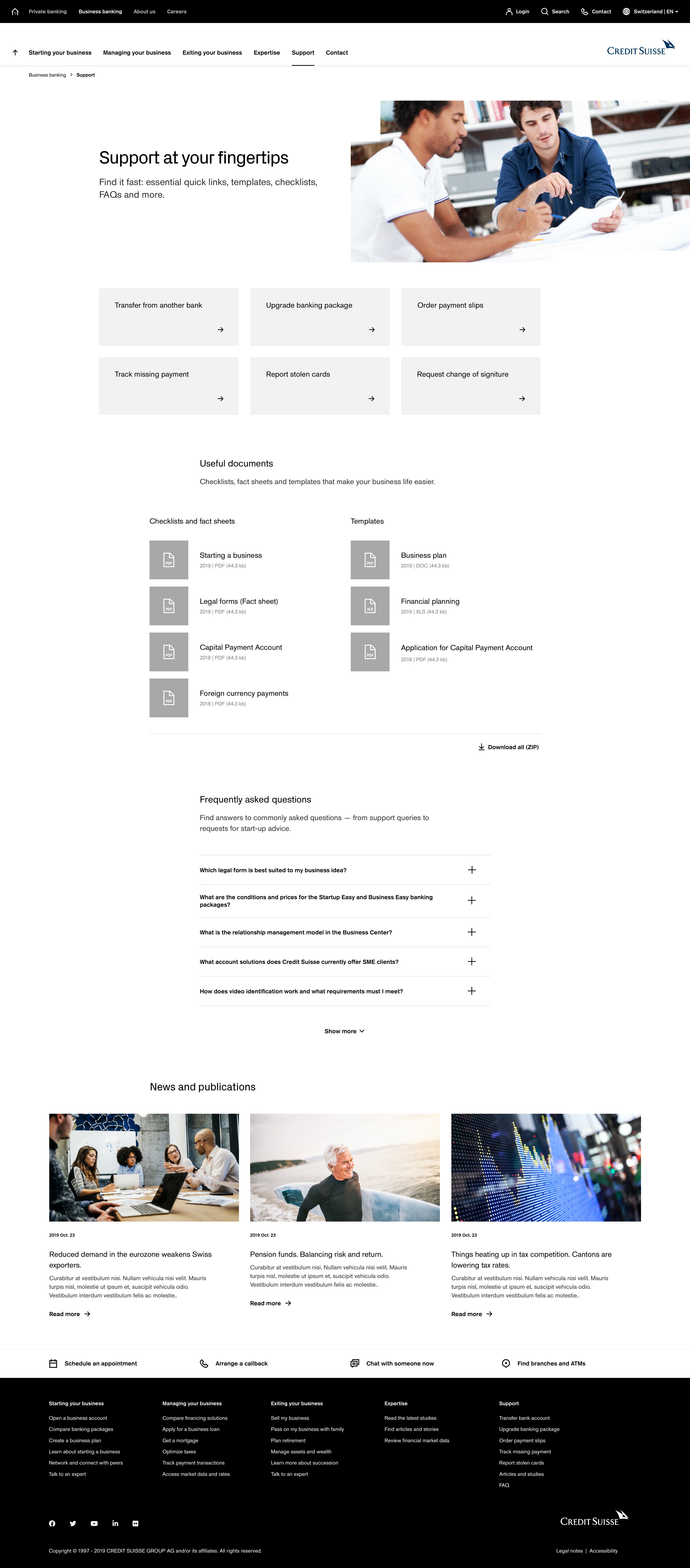
Below, you will find the end result of our design process. I have included some of the final layouts that we presented.
One of the significant challenges users face on the company's website is the navigation. The pages are scattered, making it difficult to find direct information. This challenge stems from a common misconception believed by the company: the idea that people don't scroll and everything must be visible without the need to scroll.
However, our design rule was clear: "less is more." We carefully gathered all the information relevant to users and organized it into a minimal number of pages.
Our objective was to create a clean and compact design that avoids overwhelming users with excessive data. The sections were strategically structured to align with the users' needs, ensuring they can easily find the relevant information in a convenient manner.
Every page was meticulously designed with the users' goals in mind, prioritizing efficiency and minimizing any non-relevant information. Amy Hillinges, our exceptional UX writer, played a pivotal role in ensuring the success of this endeavor.
Another crucial aspect of my role was to develop a seamless flow for two specific scenarios: one allowing users to obtain a loan estimate, and the other enabling them to schedule appointments at one of the bank's local branches. While this project was visionary in nature, we strived to maintain a sense of practicality and ensure the feasibility of our concept.
To bring these scenarios to life, I utilized Framer to create interactive prototypes.
My final responsibility involved creating a comprehensive presentation video that showcased the key findings of our visionary concept. To accomplish this, I utilized After Effects.
The pitch meeting was a success, and I quote the reaction, "We have never seen anything like this before." Our concept was largely adopted and implemented, the specific details of how it looks and functions are still under consideration. You can check the live version here.