In 2017, while working as a designer at Fantasy and collaborating on various UFC-related projects with IMG, I had the privilege of being part of a team that brought a fresh update to UFC's online presence and connected with their massive fan base of 270 million people.
The main obstacle we faced was the need for UFC to rebrand its image. The perception of the sport was often associated with blood and violence, overshadowing the fact that the fighters were highly skilled athletes who dedicated themselves to various forms of martial arts, training rigorously for one or two fights per year. Additionally, UFC possessed a vast library of articles, photos, and videos that had never been shared with the public.
Our research revealed that a significant number of fans shared UFC's goal. People were interested in learning about how athletes prepared for their matches, their training routines, and even their dietary habits. We aimed to humanize the athletes and shift the focus away from the Octogon.
To kickstart the project, our initial design team, led by Russel Hampton (Lead UX Designer) and Peter Smart (UX Director), along with Chuck Wells (UX copywriter), Madeleine DiBiasi (Manager), and myself (Lead UI Designer), joined forces in Las Vegas at UFC's headquarters for three days. We presented our findings and exchanged ideas with stakeholders from different departments. After this productive session, our team flew back to San Francisco and began working on the project.
Our primary objective for the home page was straightforward: to highlight and promote the upcoming events, enticing users to watch them. This strategic move resulted in a remarkable 47% increase in leads to new subscriptions. Additionally, users were provided with the opportunity to delve deeper into their favorite athletes' stories through engaging news articles and captivating social media updates.
By glorifying the events and creating a captivating user experience, we successfully captured the attention and interest of UFC fans, driving them to explore the website further and ultimately increasing revenue for the company.


Designing each page around the content, rather than the other way around, presented a significant challenge. One particular headache arose from the varying lengths of athletes' names, which ranged from as short as 3 characters to as long as 14 or 17 characters. Finding the optimal way to display their names and ensure readability became a constant source of concern.
While it's relatively straightforward to design with names like "Jones vs. Miocic," main events such as "Nurmagomedov vs. Jarrah" forced us to make compromises in order to accommodate the names within the design constraints.
At the top, you will find the centerpiece of every event—the main event. Beneath the main event, you find the fight cards section. Here, we showcase the full lineup of exciting bouts scheduled for the event. Explore the matchups, familiarize yourself with the fighters, and anticipate the intensity of each showdown. Lastly, we have curated a collection of related articles specifically tailored to the event.
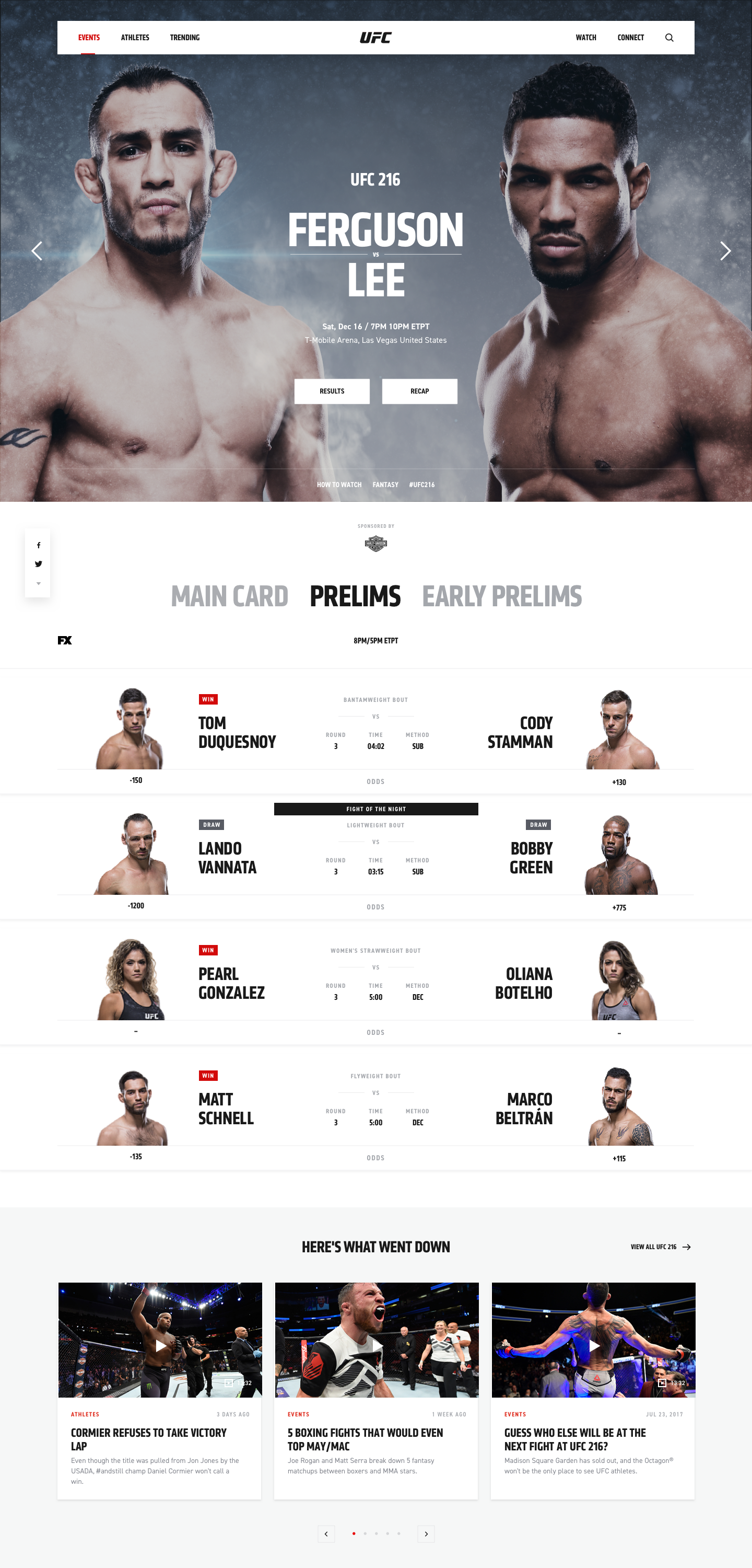

On the Fight Stats page, you will find a wealth of information and data that brings the fights to life in a statistical format. Dive into the intricacies of each bout, explore the striking and grappling numbers, and gain insights into the performance metrics of the fighters.
The Fight Stats page stands as one of the final components we developed for the project. I distinctly recall when UFC requested that we incorporate the color blue as the secondary color for this page. Even to this day, I find this choice somewhat unconventional.
I recall that in 2017, there were approximately 200 active UFC fighters. However, in the years since, this number has more than doubled, showcasing the incredible growth and evolution of the sport.
Our athletes page opens the doors to a vast array of fighters, whether they are currently active or have since retired. Delve into the profiles of these extraordinary individuals, each with their own unique journey and contribution to the world of UFC.
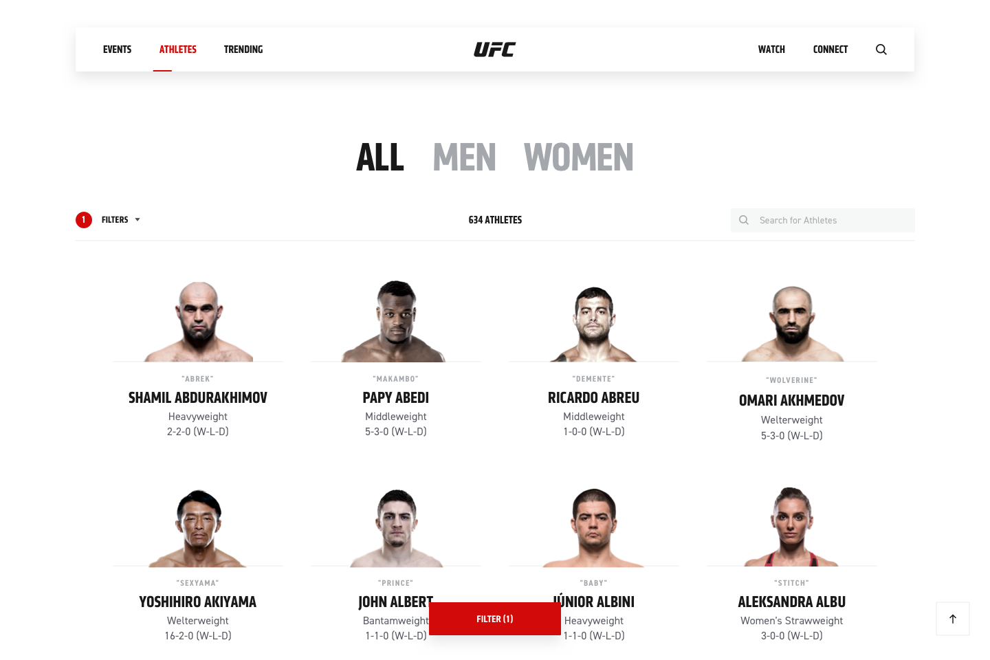

Step into their world and witness the indomitable spirit that drives them. This is an opportunity to connect with athletes who, despite their unique talents and abilities, are relatable in their humanity. Gain a deeper understanding of the incredible individuals behind the sports, and experience the power of their stories that resonate with us all.
Traditionally, article pages may not be regarded as the most exhilarating destinations. However, we set out to redefine the article experience, injecting it with an array of captivating content to captivate and engage users like never before.
Our intention was to elevate the reading experience by incorporating various forms of related content, including tweets, galleries, videos, and polls, encouraging users to explore and discover more.

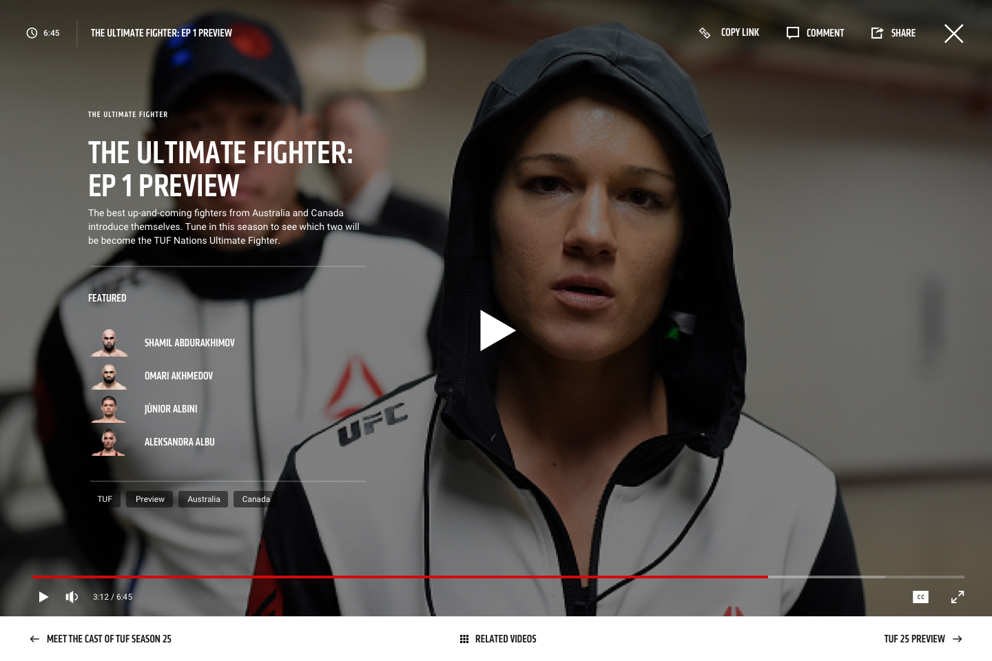
The video player grants you exclusive access to captivating behind-the-scenes content, offering a glimpse into the inner world of the UFC. Delve deeper into the lives of the athletes and uncover the untold stories that go beyond the fights.
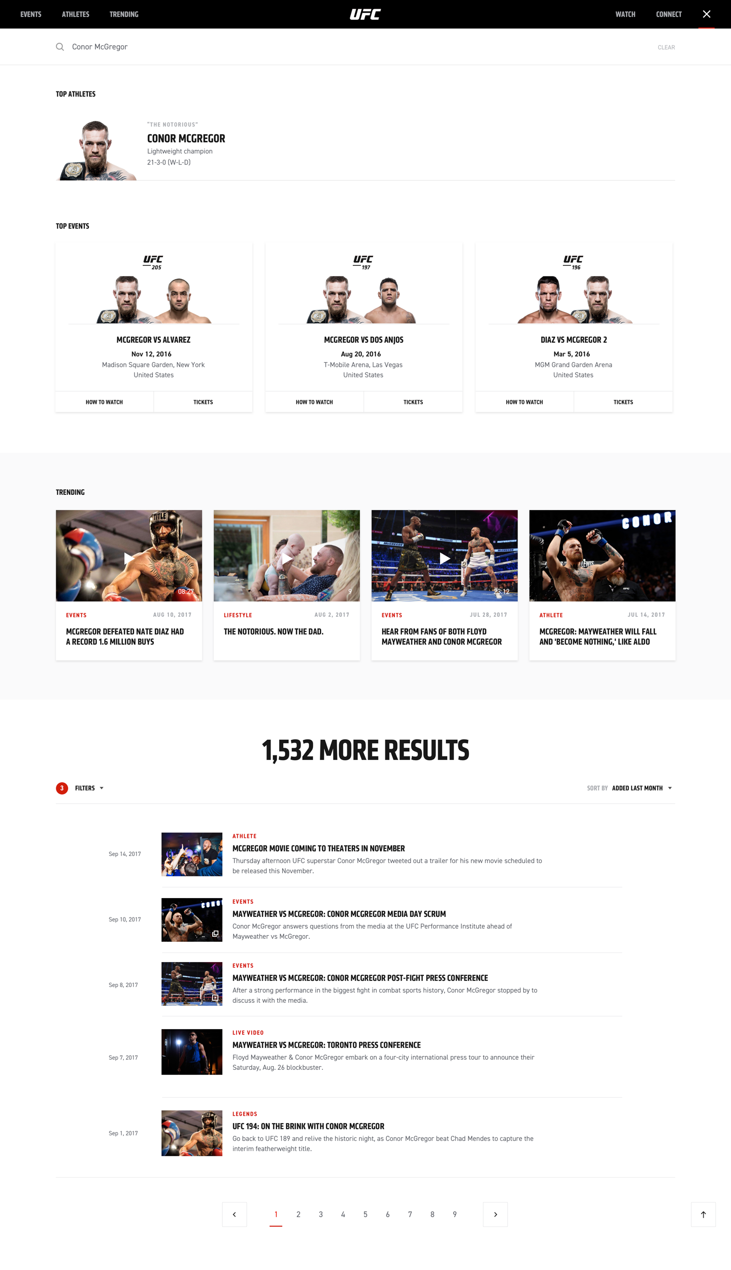
With our powerful search feature, users can effortlessly find everything they need to know about their favourite athletes.
From their inspiring journey to their impressive achievements. Explore their training routines, personal anecdotes, and exclusive behind-the-scenes content. Whether users are seeking their latest news, intriguing interviews, or engaging social media updates, the search page got you covered.

Connect with your beloved athletes through various channels, including social media, web platforms, television, apps, and games.
Show your support by purchasing merchandise associated with your favorite fighters. Special recognition goes to Tündi Szász, whose creative prowess brought this page to life. Experience the thrill of interacting with your idols like never before!
Where fans can unlock a treasure trove of captivating content that goes beyond the conventional. Delve into a wealth of never-before-seen media types, including mesmerizing videos, stunning photos, engaging social content, and thought-provoking articles and immerse yourself in the world of UFC like never before.
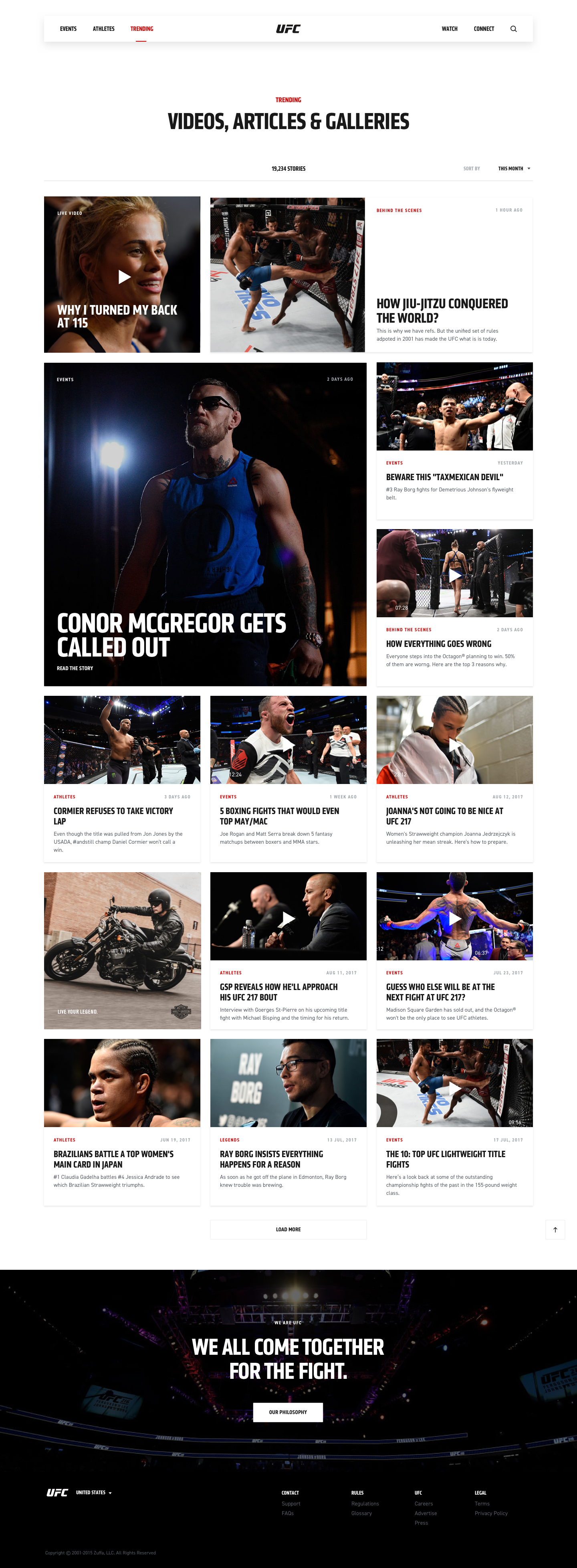
Redesigning a global brand's website is no easy task. Despite the minimalist design approach, we had to endure an 8-month wait to see our work go live. It's no surprise that we experienced mixed reactions. Some fans embraced the new design, appreciating the deeper insight into the athletes' lives, while others expressed discontent, longing for the blood and violence that the company consciously chose not to emphasize.
Design-wise, opinions were divided as well. While some people admired the minimalist approach, others likened it to a basic Wordpress theme. However, on the bright side, our efforts resulted generating a 47% increase in leads to new subscriptions. Despite the initial user dissatisfaction with the designs and small adjustments over the years, and as of 2023, the website still maintains its original design from 2017. Considering this continuity, I consider it a success.
During the project, we encountered challenges with collaboration, particularly when using Sketch. When multiple designers worked on the same project using different files, inconsistencies became inevitable. In retrospect, I truly believe that using Figma instead of Sketch would have facilitated a smoother collaborative workflow and mitigated these challenges.
Previous project
Next project