In 2017, when Royal Caribbean joined forces with Fantasy Interactive, I had the privilege of being one of the initial designers to be involved in the project. As the project progressed, it demanded the formation of a dedicated team based in Miami, and nearly everyone at the company became part of it.
A project of this magnitude inevitably leads to numerous inconsistencies when multiple designers are working on the app. Without a design system, not only does the interface lack consistency, but the navigation and animations also feel disjointed.
The app is undeniably impressive, and after a couple of years, I became curious about the users' feedback. Based on my research, I wanted to address the issues that caught my attention throughout the years and improve the overall user experience.
To gain insight into user opinions, I delved into various sources. I checked the app store comments, but most of the negative feedback was related to the service: some users found the staff or support team unhelpful, and there were instances where dates and times were not updated in the app, causing difficulties for many clients. Fortunately, I stumbled upon two YouTube videos where frequent travelers reviewed the app. I carefully analyzed both their thoughts and my own observations to inform my next steps.
The latest layout got extremely busy with all the different style of buttons because of one simple reason: users just can not navigate properly. The gesture based navigation is not intuitive and the main functions appearing at the top are out of sight and reach. Applying Jabob's law and not reinventing the wheel, I added a tab bar instead. This change enables the user to navigate within the app easier and access hidden content which was ambiguous in the current version.
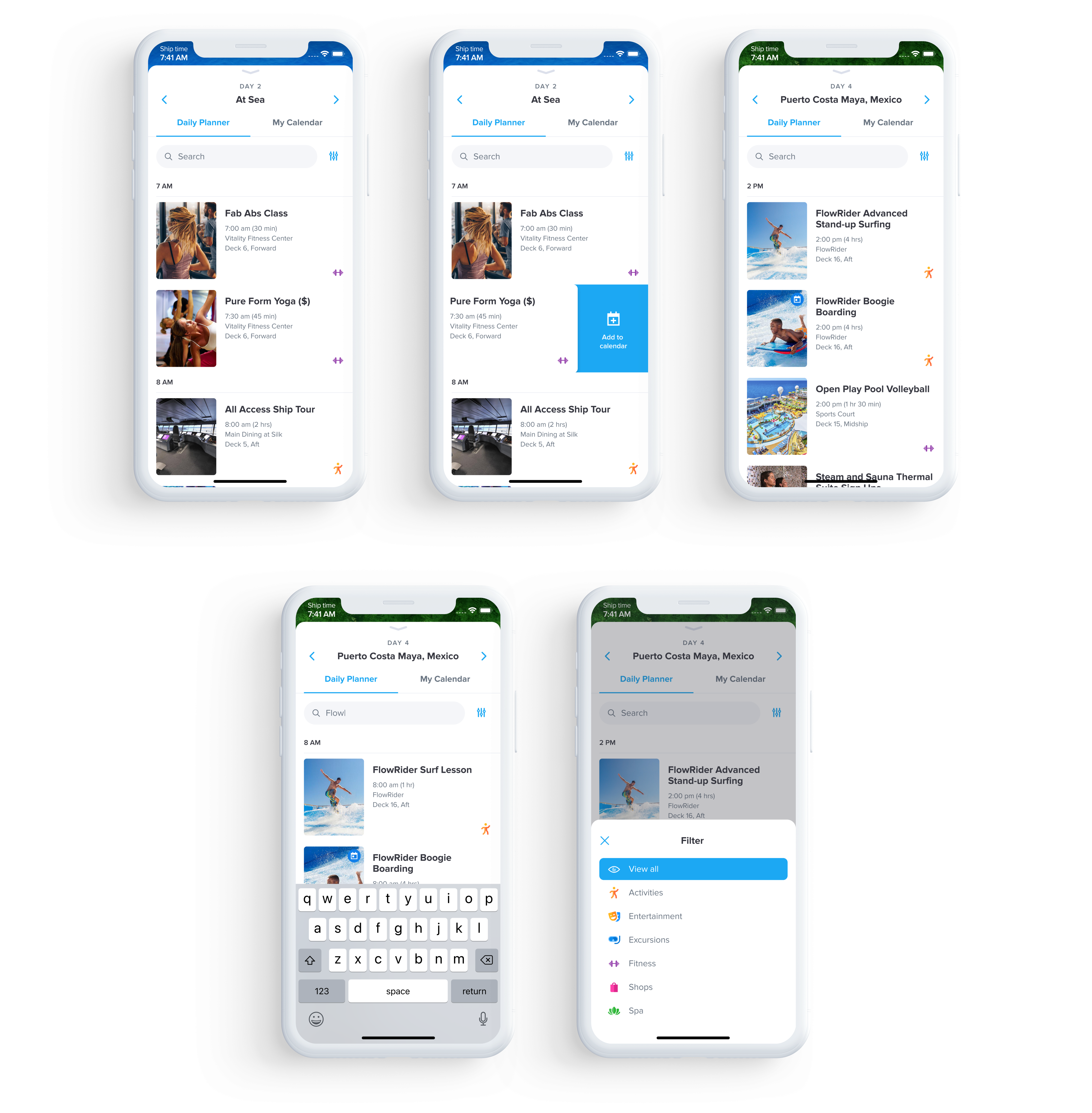
The daily hints button has been merged with the daily data, including temperature, sunset time, and other relevant information. Instead of presenting this information as an animated slideshow, I made it scrollable to eliminate any waiting time for the user. Additionally, navigation buttons have been placed at the top, enabling users to easily switch between different days without having to open the daily planner each time.

The main issue with the daily planner layout was the lack of indication regarding the location when selecting a different day at the bottom. To address this, I added the location information to the top. This change ensures that users are aware of their selected location at all times.
Furthermore, I simplified the visual appearance of the layout by eliminating unnecessary background colors and lines. This modification creates a cleaner and more streamlined design, allowing users to focus on the essential information and tasks.
In terms of functionality, I replaced the right-aligned filter list with an action modal. This modification enhances the user experience and makes the interaction feel more natural and intuitive.
To further assist users in finding activities quickly, I incorporated a search bar. This addition enables users to easily search and locate specific activities within the planner, saving them time and effort.

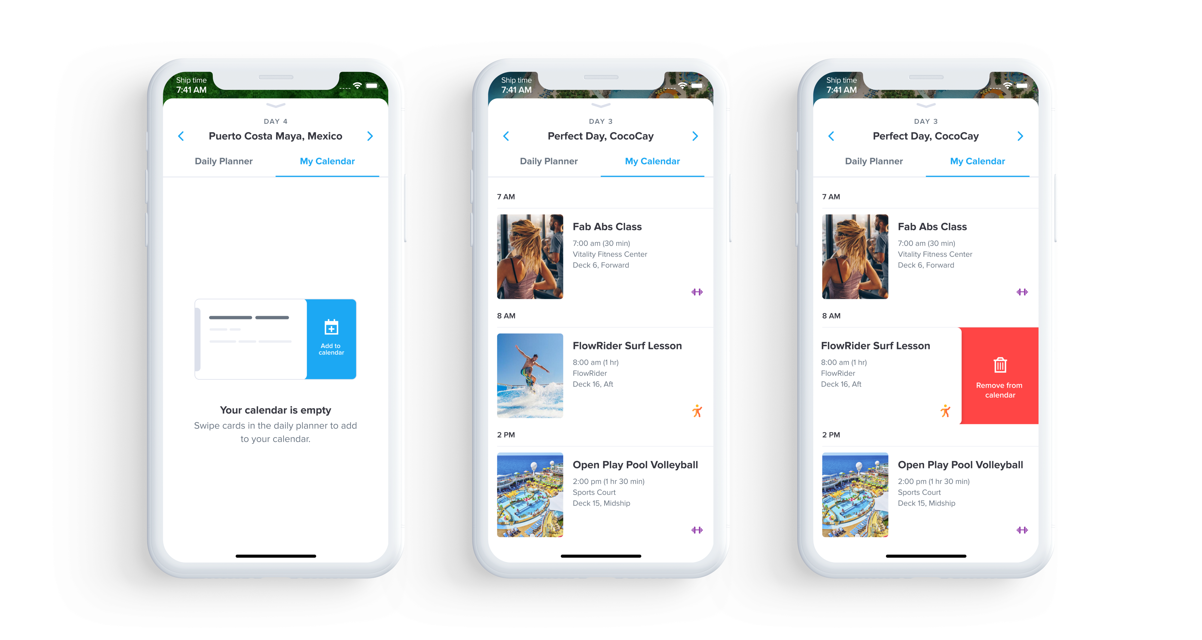
The calendar also underwent a significant redesign. In the previous version, users were not adequately informed about how to add activities to their calendar. To address this issue, I implemented a helpful hint that appears when the calendar view is empty.
Additionally, I made a crucial improvement to the layout of the calendar. Instead of utilizing endless slots that required users to scroll each time to find added items, I opted for a simpler list format. This change eliminates the need for excessive scrolling, allowing users to quickly locate and manage their scheduled activities.
While it's important for different views to have distinct appearances, functionality should never be compromised. In this case, I prioritized usability and opted for a more user-friendly design approach to ensure a smooth and efficient experience for all users.
Furthermore, I simplified the visual appearance of the layout by eliminating unnecessary background colors and lines. This modification creates a cleaner and more streamlined design, allowing users to focus on the essential information and tasks.

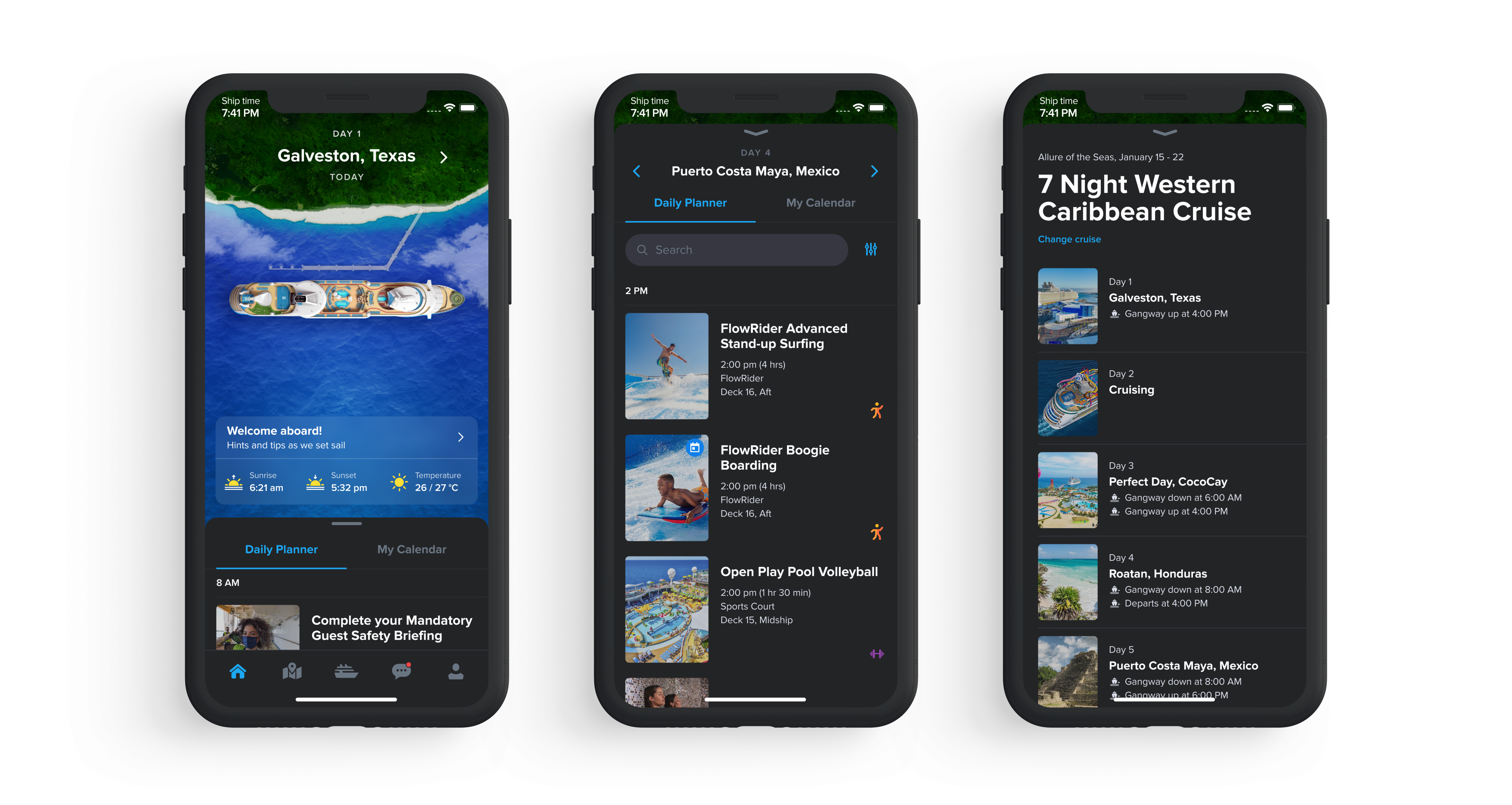
In the "Voyage" screen, I maintained the card format that I previously implemented on the daily planner screen and enhanced visual by displaying captivating photos of destinations. This update provides users with a more immersive and informative experience compared to a simple anchor or wave icon.
Additionally, I included essential information regarding the departure and return times for passengers. This addition ensures that users have clear guidance on when they can leave the ship to explore destinations and when they should be back on board.

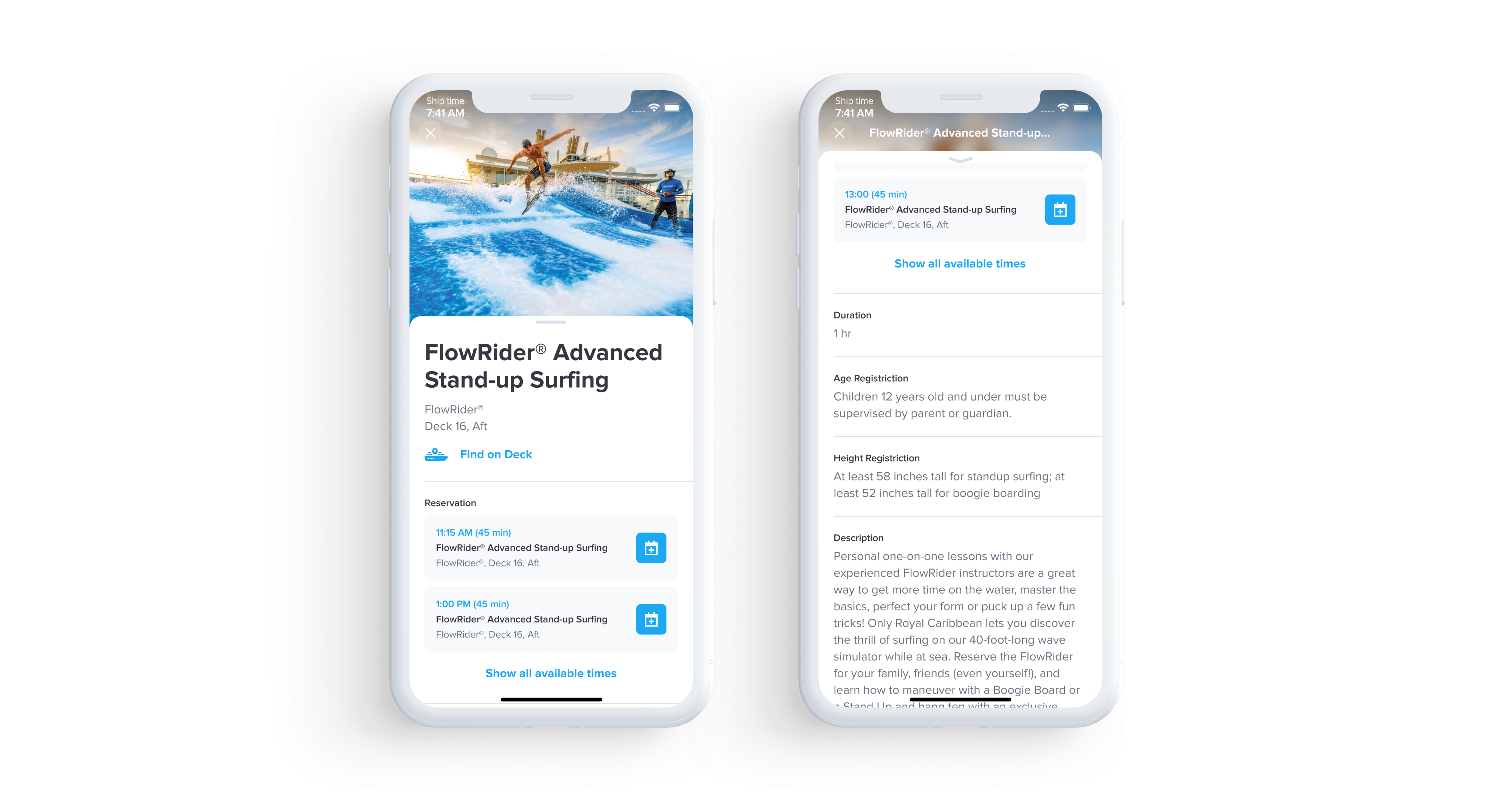
I made a couple of changes to enhance the user experience. Firstly, I replaced the top arrow left icon with a close icon, which better aligns with the natural flow of the view. As the event detail page appears from the bottom, using a close icon instead of an arrow left icon feels more intuitive and organic.
Furthermore, I revamped the reservation cards from a horizontal layout to a vertical one. This modification allows users to have an instant view of the reservation details without requiring any additional interaction.

Another highly requested feature by the users was the implementation of a dark mode theme that automatically adjusts based on the ship's time. In response to this feedback, I created a dark mode theme that enhances the user experience during nighttime.
With the dark mode enabled, the user interface intelligently adapts and switches to a darker color scheme as the evening sets in. This not only reduces the strain on users' eyes but also helps conserve battery life, especially in low-light conditions.

Previous project
Next project